Warner Bros. Discovery approached me with a thrilling project: to design a graphic package for a brand-new stand-up comedy programming line on NOVE.
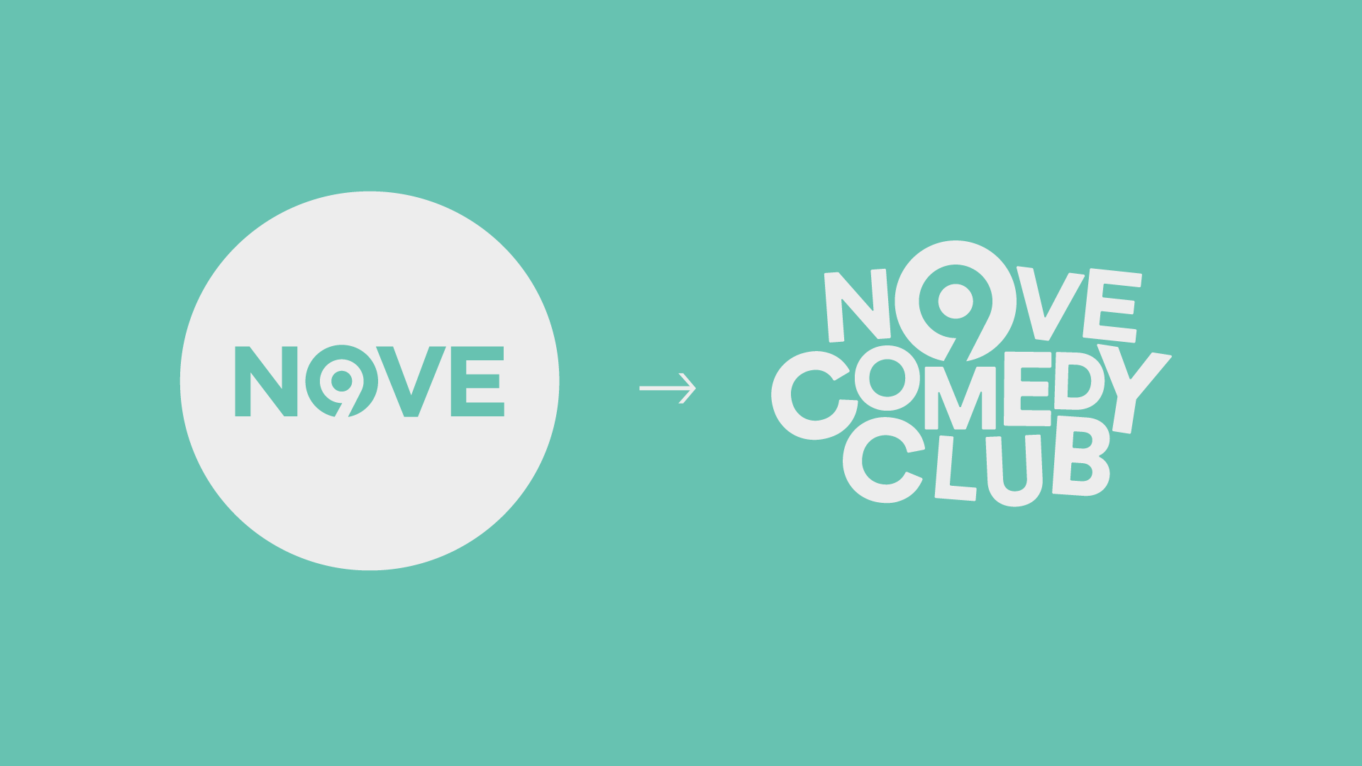
NOVE isn't just any channel – it's got a striking brand identity, featuring a distinct logo, a circle-based design, a minimal color palette, and its text elements rocking Circular Pro.
The solution
To disrupt and reassemble the channel's communication style in a way that stays true to NOVE's core, yet perfectly captures the diverse facets and flavors of laughter.

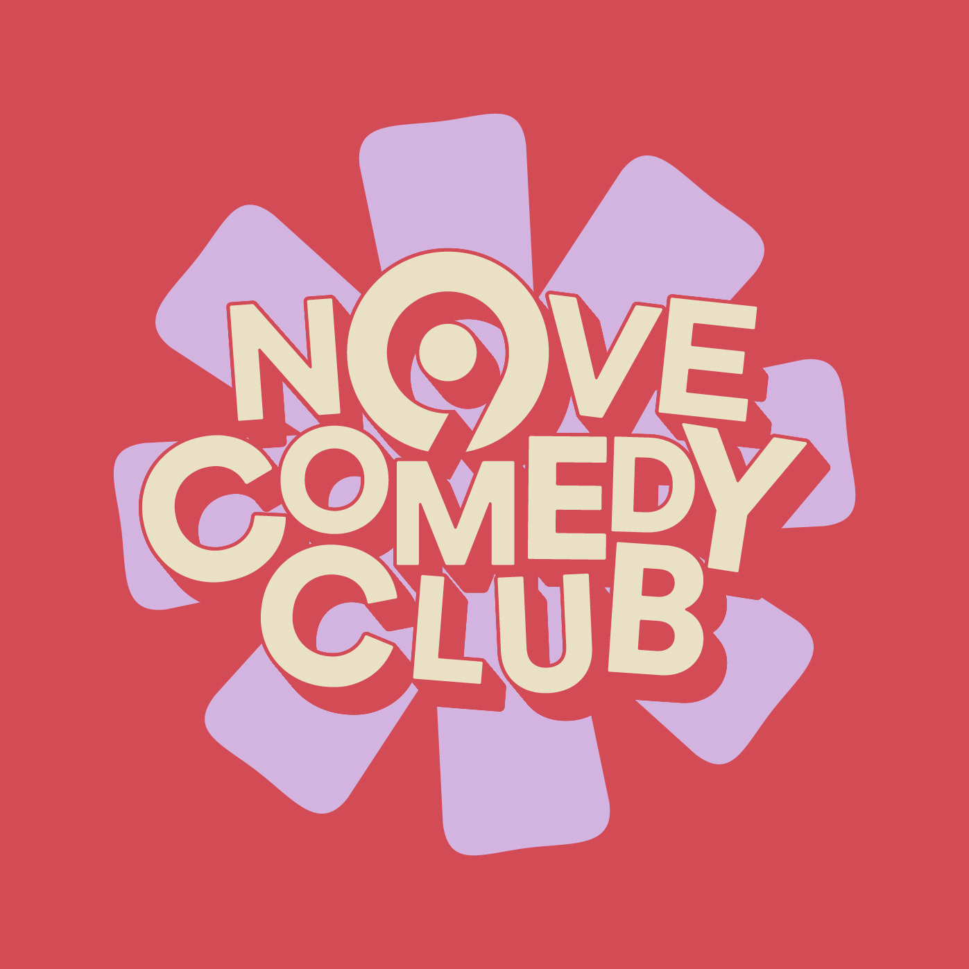
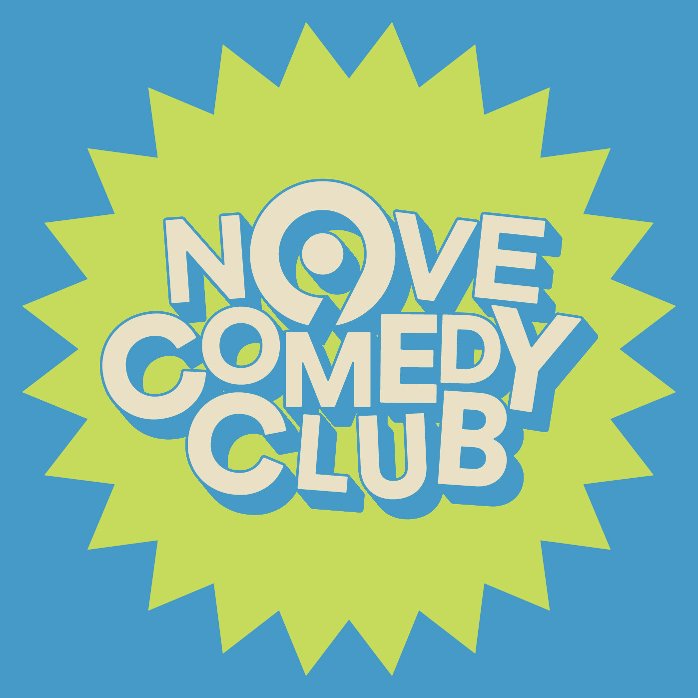
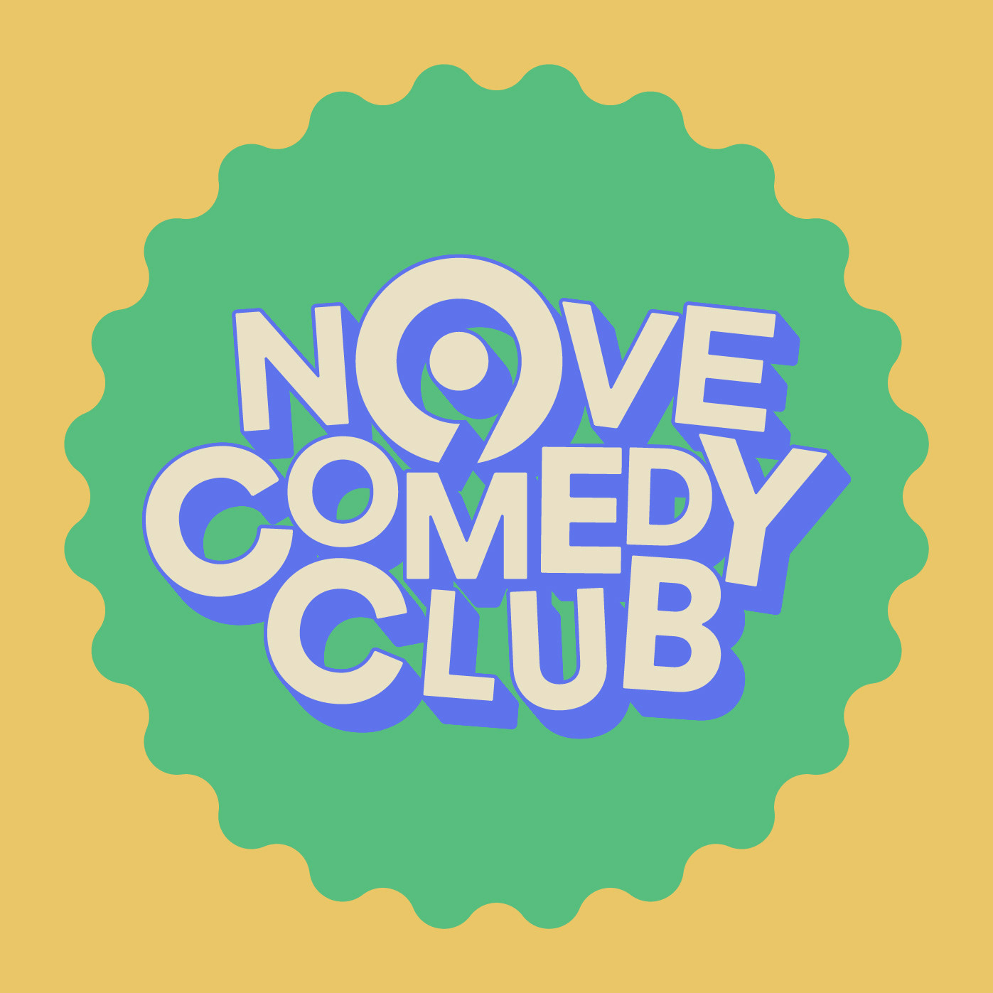
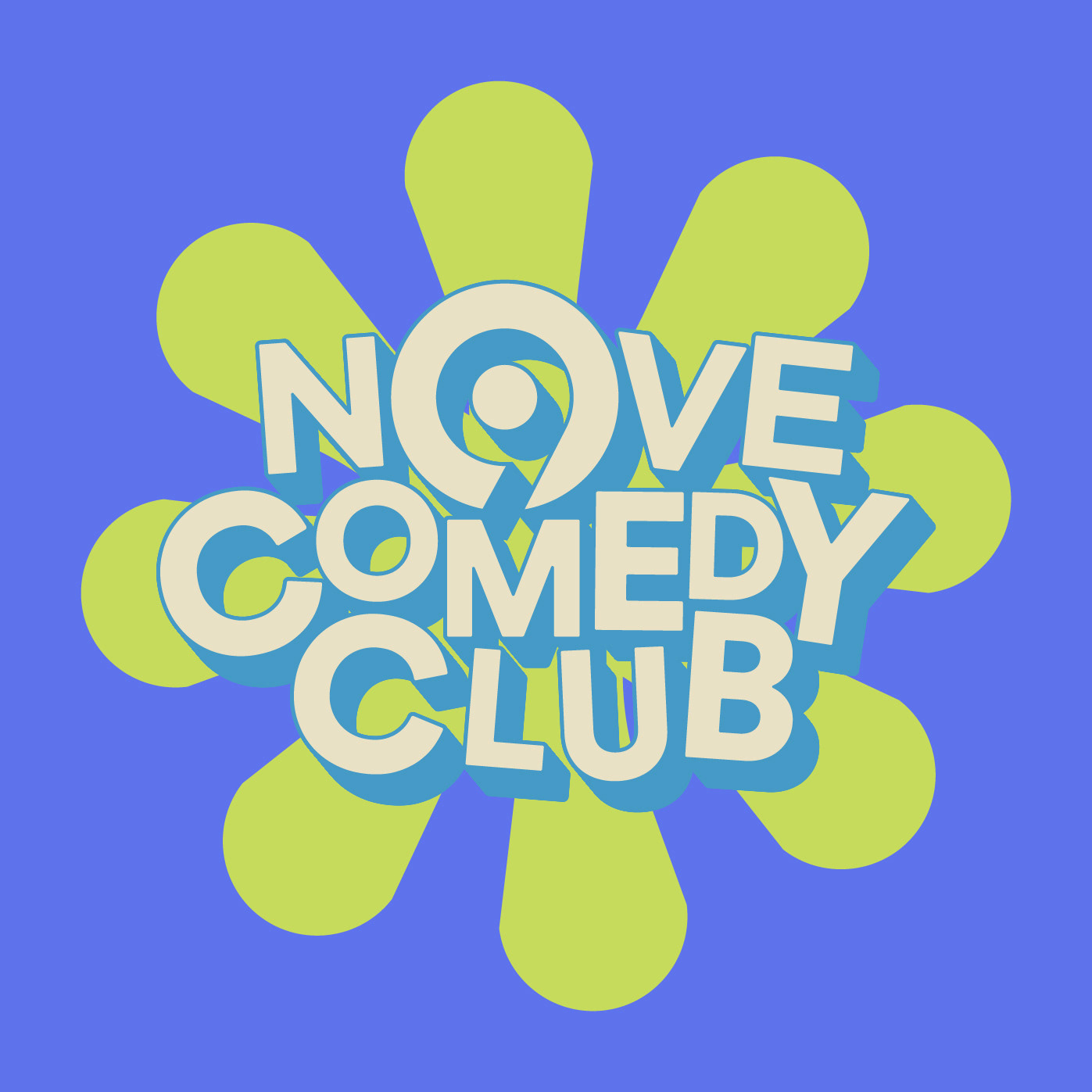
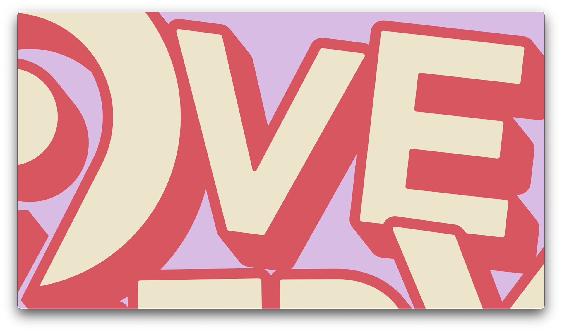
I kicked off with the logo design, which takes the core institutional one but gives it a fun and unexpected twist. This playful reshuffle of all the letters turns it into an integral part of the program's logo, without losing its original identity. The seeming chaos of the letters actually becomes a standout feature, perfectly embodying the essence of the brand.
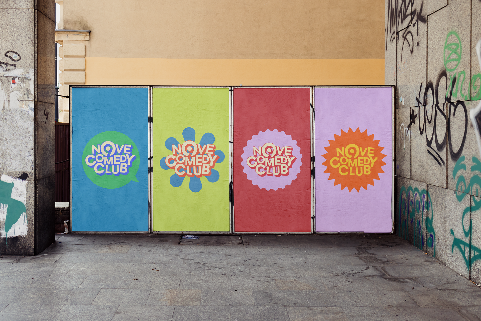
The same fate befell our poor circle, which, in its new interpretation, sheds its austere, orderly vibe to embrace shapes and colors bordering on the absurd. This transformation allows the circle to leap out of its conventional role, injecting a dose of whimsy and unexpected delight into the design.

Credits
Art direction: Chiara Cerutti
Design e Animation: Federico Pascali
Sound Designer: Carlos Zarattini.
Producer/Coordination: Benedetta Varalda
Realized for: Warner Bros Discovery © Copyright 2023
Design e Animation: Federico Pascali
Sound Designer: Carlos Zarattini.
Producer/Coordination: Benedetta Varalda
Realized for: Warner Bros Discovery © Copyright 2023


